
Over the past two months, the US initial jobless claims was among the most closely monitored indicators by policy makers, analysts and media.
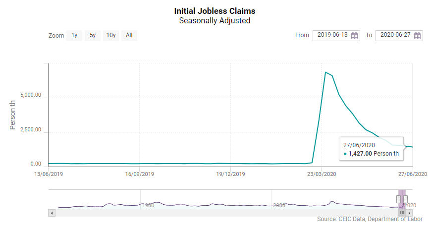
The jobless claims published by the US Department of Labor every Thursday, skyrocketed after the introduction of lockdown measures and the massive business closures due to the spread of the COVID-19 epidemic in the US. Analysts were keeping their eyes on the weekly jobless claims in an attempt to anticipate how deep the looming recession would be, painting a gloomy picture of massive unemployment, poverty and social unrests comparable to those during the Great Recession in the 1930s.
And indeed, due to their timeliness and high frequency the initial jobless claims have become one of the main predictors of the US labour market conditions since they were first published by the US Department of Labour in 1967 and as such they have been widely used to nowcast the unemployment rate for the reference month. The initial jobless claims have proven to be a successful leading indicator that has predicted not only the increases in the US unemployment rate during previous downturns, but also the business cycle turning points. In 2008, the most recent example, the jobless claims had started to climb rapidly since early-May, while the unemployment rate remained relatively flat until the last quarter of the year when it started to increase gradually. Due to its strong predictive power the initial jobless claims indicator is one of the key components of the US CEIC Leading Indicator, a CEIC proprietary dataset aimed to anticipate the business cycle turning points.
However, the monthly employment report published in the first week of June was far more positive than expected. Although the initial jobless claims remained at levels unseen before the COVID-19 pandemic over the entire month, the US labour market actually improved in May compared to the previous month, which surprised economists all over the world, realizing that the devastating impact of COVID-19 on the US job market was real, but highly exaggerated. How did we all get it so wrong on the jobless claims data?
While the jobless claims report has always been closely monitored, since the beginning of the lockdown in the US it has attracted even more attention as a gauge to estimate the COVID-19 impact not only on the US economy, but on the global economy as a whole. The indicator skyrocketed to 3.3mn initial jobless claims on March 21, which was more than ten times the value from the previous week and the average values from the past few years. A week later, the indicator more than doubled to 6.9mn claims. These unseen levels triggered gloomy predictions for the US economy, echoing the labour market collapse in the 1930s during the Great Depression and suggesting similar levels of unemployment. However, the monthly US payrolls survey released on 5 June showed that the apocalyptic scenarios for the US labour market economy as a whole were highly unlikely. The data showed a surprising gain of 2.5mn jobs and unemployment rate of 13.3%, down from 14.7% in April and contrary to the wide-spread expectations for another massive job cut wave in May and above-20% unemployment rate. The encouraging labour market data and growing stock market have sparked optimism that the business cycle in the US has hit a trough and the economy is entering a recovery phase.
Before digging deeper into the statistical peculiarities of the jobless claims data, one fact worth reminding is that the financial markets did not react to the release of the all-time high of 3.3mn jobless claims data for the week ending on 21 March, although the expectations were for only half that figure, or to the twice larger figure a week later. Instead, the Standard & Poor’s 500 index increased by 6.2% on March 26, when the initial jobless claims of 3.3mn for the week ending on March 21 were released, and the US 10-year treasury bonds yields declined due to the expectations for a government stimulus package.
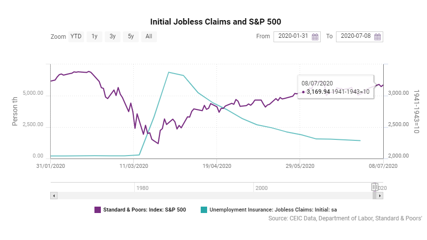
The markets disregarded the jobless claims data, despite their record high levels. And it was not a surprise. After the lockdown, the US economy, just like most of the other major economies back then, faced a sudden halt - a situation unseen in the recent economic history of the industrialised world. As expected, the country-wide closures of factories and businesses triggered massive layoffs and millions of workers left without income. Regardless of whether these business closures were temporary or permanent, the unemployment benefits remained the only source of income for most of these workers during the lockdown. However, a big part of these people were expected to come back to work after the lockdown, especially given the stimulus packages, on the one hand, and the relatively high flexibility of the US labour market compared to the rest of the developed economies, on the other hand. Considering this, the markets already expected a surge in initial jobless claims and the fact that the increase was much higher than what had been anticipated was not enough to cool down the optimism over the expected good news - the stimulus package.
Even though the initial jobless claims remain a powerful gauge that provides an early picture of the US labour market, there are some peculiarities that need to be considered, especially for extreme values like the ones observed recently. First, the data does not reflect the net job losses. Instead, the initial jobless claims data counts only the new unemployed that lost their job during the reference week, but it does not take into account people who have found new jobs during that week. This explains the net job gain in May, despite the 2.5mn initial jobless claims per week on average in the same month. The indicator that reflects the net increase in jobless claims is the continued jobless claims, i.e. the number of people that receive unemployment benefits in a given period. In other words, a change in the current jobless claims for a week reflects the initial jobless claims less the number of people who had been receiving unemployment benefits, but have found a job during week. And even though this indicator provides a more accurate picture of the labour market condition, it is less popular than the initial jobless claims, because it is released with a one week lag. As of May 30, continued jobless claims, i.e. the number of people that were currently receiving unemployment benefits, was 20.6mn, which was 1.94mn less than the week ending on May 2. The continuous jobless claims peaked in the week of May 9 at an all-time high of 24.9mn, which was way below the 42.7mn initial claims accumulated since the beginning of the lockdown.
Unemployment Insurance
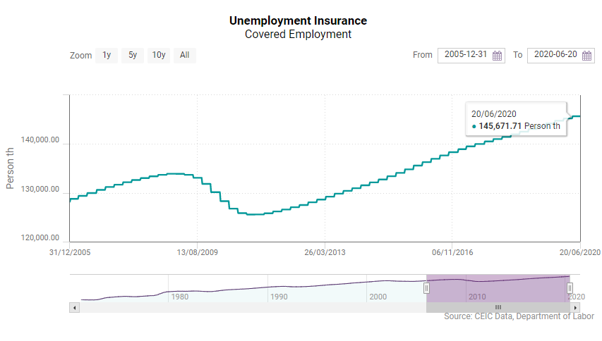
The reason for the better-than-expected May employment report is straightforward - new jobs created in May were more than the job cuts. However, the net change in continued jobless claims in May and the employment increase in the same month are not the same. This is because not all the people who lose their jobs are eligible to receive unemployment benefits, which explains also the differences between the insured unemployment rate, an indicator that is a part of the weekly jobless claims report, and the surveyed unemployment rate, which is published with the monthly employment report. In fact, the number of people eligible for unemployment benefits in the US has been constantly increasing, which has also contributed to the higher jobless claims during the lockdown. As of end-2007, before the global financial crisis, the number of people eligible for unemployment benefits, or covered employment, was 132.6mn, or 86.2% of the US labour force, while as of May 30, 2020 this number is 145.7mn, which is 92.2% of the labour force. This represents a 9.8% increase in the covered employment, while at the same time the US labour force increased by only 2.8% and the pre-lockdown employment was 5.7% higher than that in end-2007.
Another factor that should be taken into account is that the initial jobless claims data is seasonally adjusted. The seasonal effect on the initial jobless claims data in March, April and May, when the figures skyrocketed, is downward. In other words, in normal times the data for this period are adjusted upwards in order to eliminate the seasonal downward effect. This usually affects between 7%-8% of the initial jobless claims. Before the lockdown, when the average weekly initial jobless claims were around 240,000, the seasonal adjustment effect meant adding less than 20,000 jobless claims. During the 13 weeks since the beginning of the lockdown, the seasonal adjustment has "added" 3.9mn more initial jobless claims. In the week that ended on March 28, when the weekly initial jobless claims hit the peak, the seasonally adjusted data showed 6.87mn jobless claims, while the non-seasonally adjusted one was 6mn, or 870,000 people less.
Learn more and access our free, comprehensive economic reports for eight regions, including the United States, from the CEIC Q2 2020 Economic Snapshot Reports.